High-Performance Dashboard UI for Capital Improvement Planning
A responsive, interactive interface for optimizing utility infrastructure investments.

Client
McGovern McDonald Engineers
Water treatment industry
Engineering consulting
Financial forecasting
CIP Optimization
Role
UX Designer
1 year, 10 months
Remote team
Cross team collaboration
Agile methodology
CIP Dashboard Overview
A Capital Improvement Plan (CIP) is a long-term strategy used by public utilities to schedule, fund, and manage major infrastructure projects, which are significant investments such as water treatment facilities, pipeline upgrades, or sewer expansions.
This CIP dashboard was designed to support cross functional teams with a flexible and user friendly interface and to help utilities move from fragmented spreadsheet-based planning to a centralized, collaborative platform.
Design Challenge
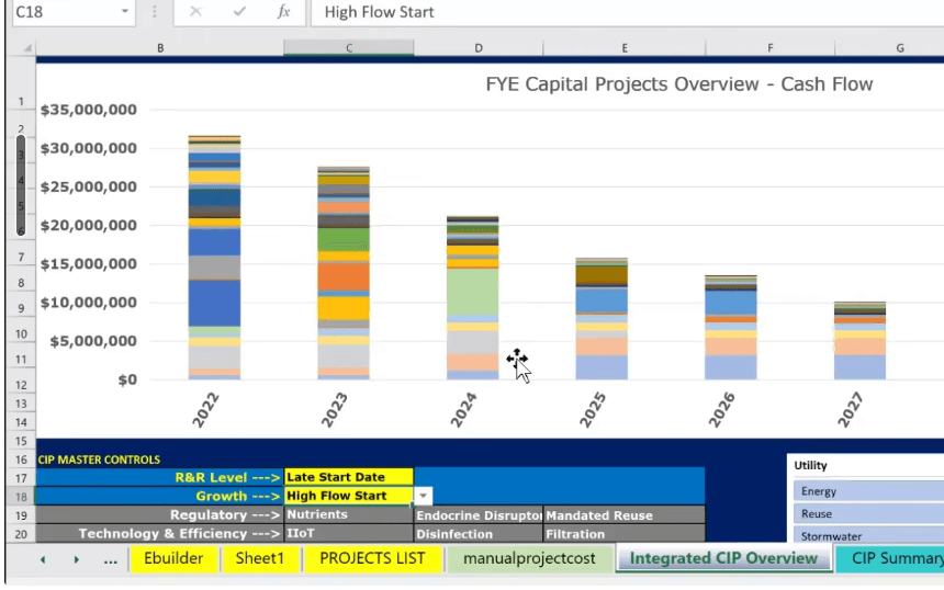
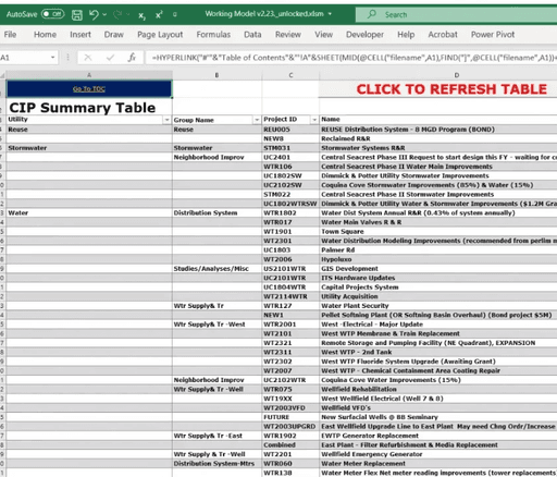
Our goal was to adapt an excel model (images below) to a user-friendly web app that combines project and financial planning, scales with user needs, allows for cross team collaboration, and provides real-time insight into costs, spending outcomes, and rate stability.
Design Requirements
User-Centric Design: Ensure that both technical and non-technical users can navigate and utilize the platform effectively.
Flexible Planning and Visualization: Enable users to seamlessly transition between short-term (5-year) and long-term (50-year) planning horizons, with the ability to adjust views in 5-year increments.
Adaptive and Performant Design: Ensure optimal performance and usability across various devices, from tablets to desktop computers, accommodating the diverse environments in which users operate. The app must handle a wide range of project loads, from small municipal initiatives to extensive infrastructure programs, without compromising performance. All designs must be scalable and responsive.
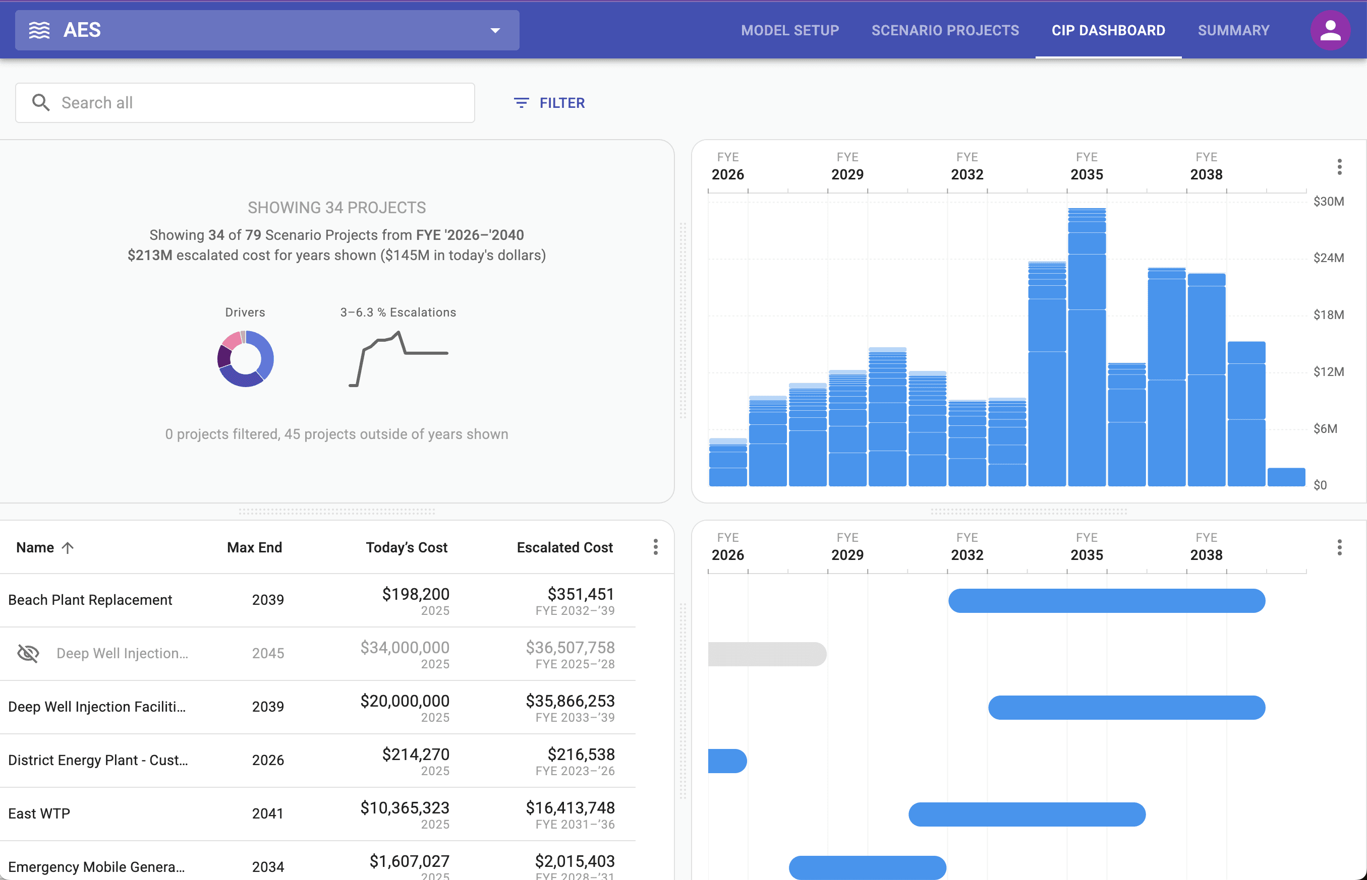
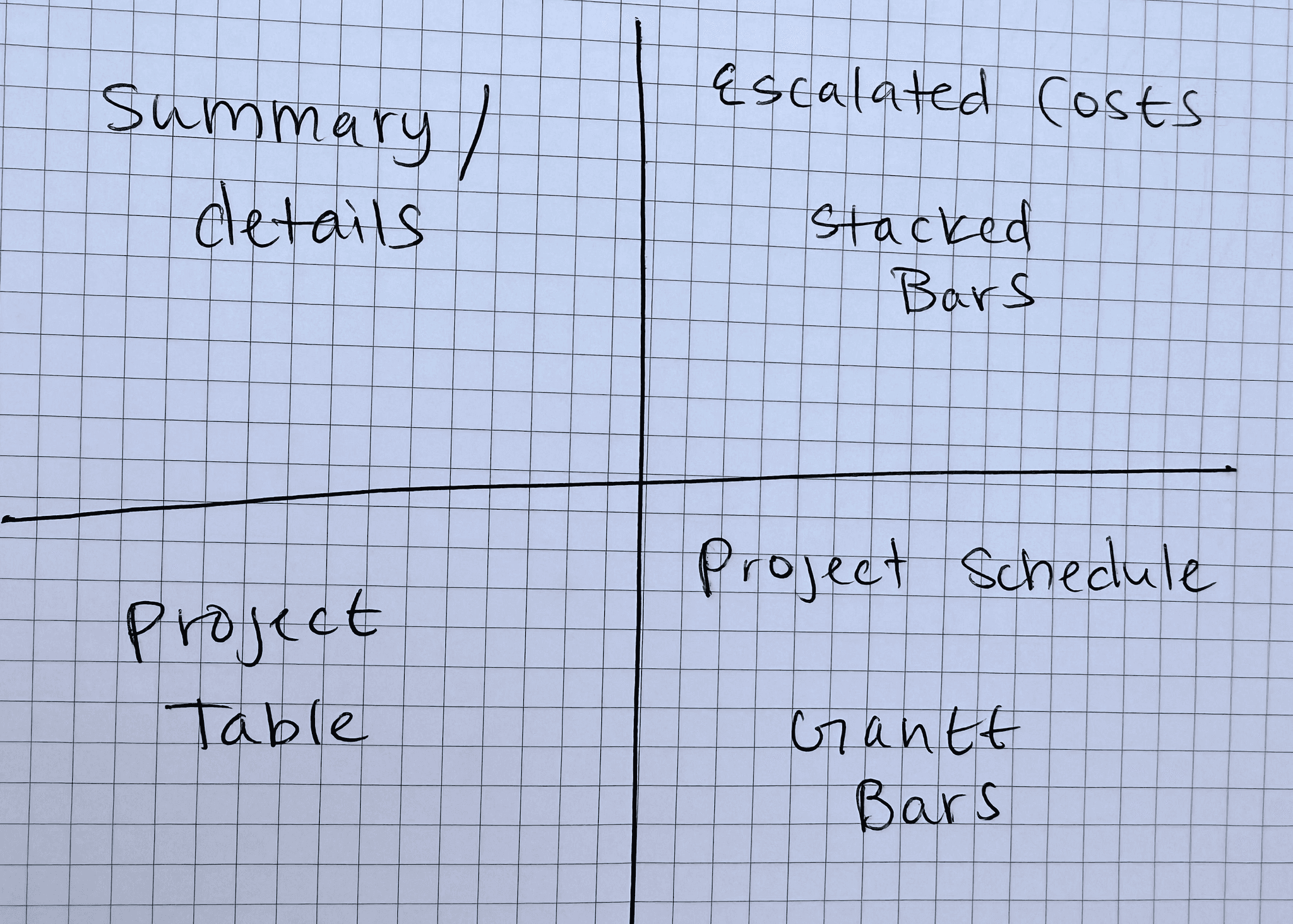
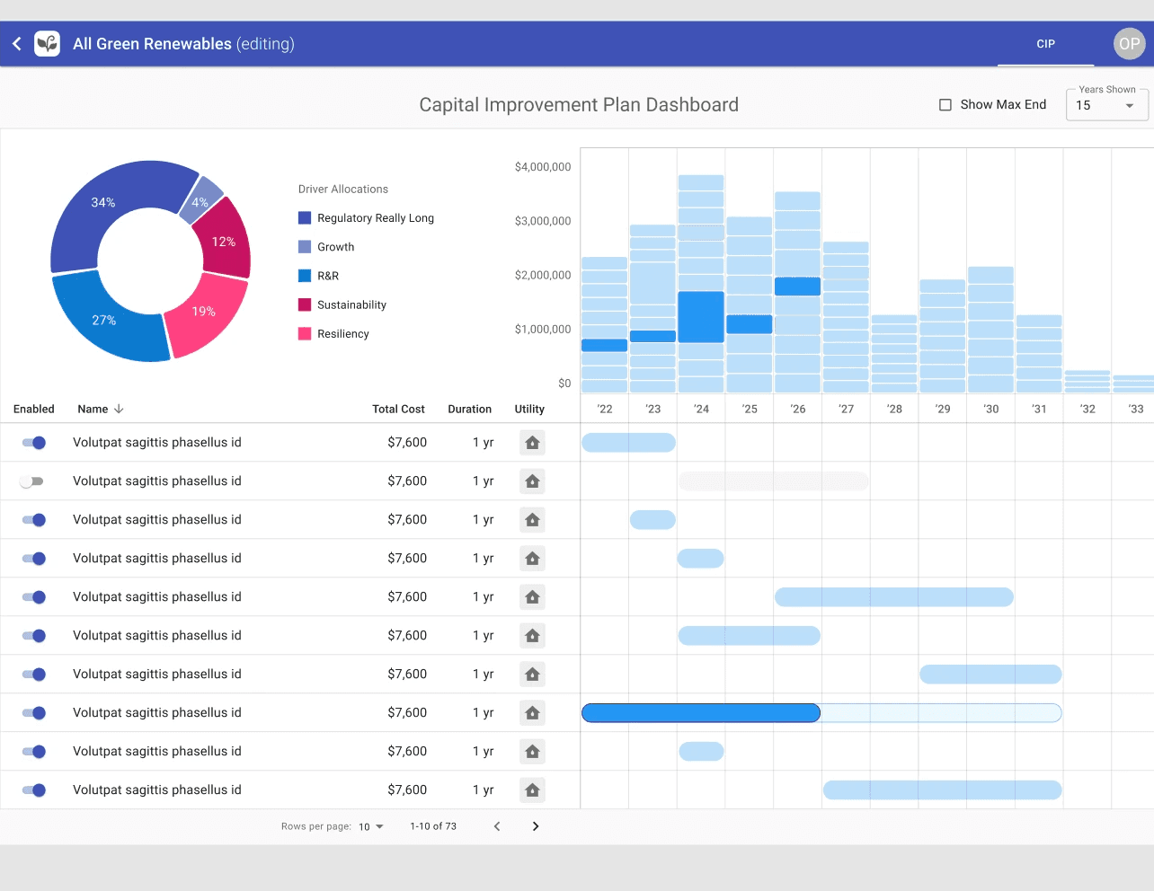
Quadrant Layout: Allow users to understand how project timelines influence costs in a single, interactive view.
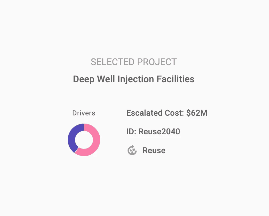
Strategic drivers or context view (top-left).
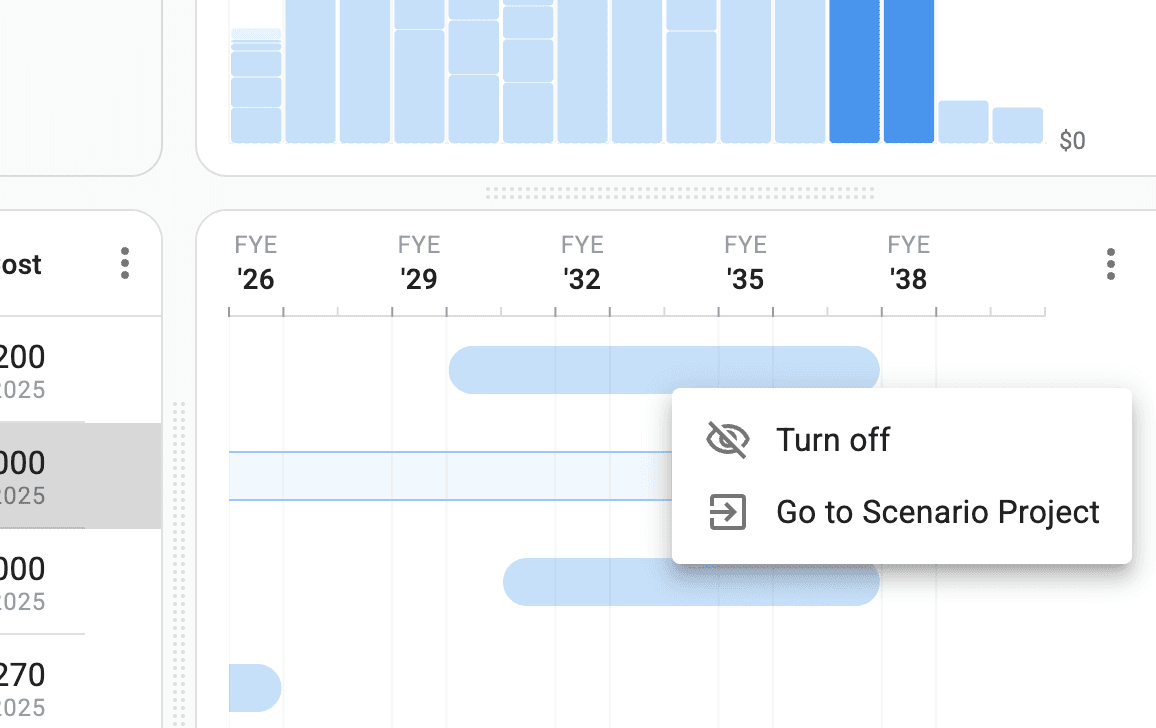
Stacked bar chart (top-right) representing escalated yearly project costs.
Gantt-style chart (bottom-right) showing project schedules.
A project table (bottom-left) listing project names and attributes.
Early Iteration
Initial Proof of Concept: The first CIP Dashboard validated the quadrant model as an effective way to combine financial forecasting, scheduling, and project data in one interactive interface. The stacked bar charts clearly visualized financial impacts, though they were not initially draggable.
Usability Challenges Identified: Usability testing revealed key issues including lack of ability to click and drag on stacked bar segments, limited project visibility, restricted sorting options, lack of search and filtering, confusion around the driver donut chart, poor responsiveness on smaller screens, and insufficient access to detailed project editing.
Post Usability Testing Improvements
More Intuitive Drag & Drop: Enabled direct manipulation of project timelines within the stacked bars chart and resolved technical issues that previously interrupted drag interactions.
Improved Viewport Ergonomics & Responsiveness: Optimized the UI for responsiveness, maintaining usability and clarity across stacked bars, Gantt segments, and tables—even on the smallest supported screen size, an iPad in portrait mode.
Adjustable quadrants: Allowed users to view each quadrant at varying sizes, to allow for ability to view and manipulate dense data sets.
Improved Project Table: The initial paginated table was replaced with infinite scrolling.
Filtering & Segmentation (Left): Introduced keyword search, dynamic filters (e.g., by cost, utility type, timeline), and integrated the driver donut into a streamlined filter menu. Users can also sort projects by any column using a custom column configuration tool, enabling more focused and efficient scenario planning.
Final Designs - High-Performance UI for Complex Scheduling
The following visuals showcase the final implementation of the CIP Dashboard.
Outcome and Impact
Flexible, Scalable Interface: The CIP Dashboard adapts effortlessly from small initiatives to large portfolios, offering real-time drag-and-drop timeline adjustments and contextual hover states for instant clarity in dense data environments. Smooth animations and immediate feedback empower users to make rapid, confident planning decisions.
Minimal, Purposeful Visual System: Built on MUI React components with custom elements, the final design emphasizes a clean, structured aesthetic. A restrained color palette, clear hierarchy, and generous spacing reduce cognitive load and support sustained use with complex financial and project data.
Pilot Deployment & Validation: One of our public-utility research partners fully integrated the dashboard into their CIP workflow, providing in-depth usability feedback alongside internal subject-matter experts and industry advisors. Their overwhelmingly positive response confirmed both our feature priorities and overall product direction.
Tangible Operational Impact: By replacing static spreadsheets with an interactive interface, planners now complete tasks in minutes rather than months, bridge communication gaps across engineering, finance, and operations, swiftly compare “what-if” scenarios, and shift seamlessly between tactical execution and a 5-to-50-year strategic outlook—all while laying the groundwork for future feature expansion.
Next Steps
Project Dependencies & Grouping: Define and visualize task linkages and logical project clusters within the dashboard, ensuring that interdependent activities and grouped initiatives render clearly in all instances.
Ongoing Usability Testing & Iteration: Continue engaging CIP managers, finance teams, and engineers test sessions to validate new interactions, uncover edge-case workflows, and refine UI patterns until the experience seamlessly supports real-world planning needs.
Market Validation & Adoption: Partner with additional public utilities and private infrastructure firms to run extended pilots, gather quantitative adoption metrics, and sharpen the value proposition—setting the stage for a targeted go-to-market rollout.
Enhanced Financial Modeling: Build out advanced forecasting modules, including rate-setting calculators, multi-year budget simulators, cash-flow analysis, and funding-optimization tools, to empower finance teams with deeper scenario planning and regulatory compliance.
Systems Integration Strategy: Develop seamless, bi-directional connections between the CIP Dashboard and leading municipal ERP, asset-management, and financial-planning systems, ensuring real-time data synchronization and embedding the tool naturally within existing utility technology environments.