Klevahealth UX
High impact usability testing leads to dashboard redesign and product streamlining.

Client
Klevahealth
Health and Wellness Industry
Start Up
Digital Health
Role
UX Designer
1 month
Remote team
Cross team collaboration
Project Overview
Kleva Health Dashboard Redesign: Kleva Health was a digital-health startup who launched an FDA-approved at-home COVID-19 test. When this project began, their existing site didn’t support purchases, and the post-purchase dashboard was virtually empty. Over four weeks, I led a full redesign—taking existing Figma screens, refining them into a cohesive prototype, and guiding the product from wireframes through usability testing to final hand-off.
Design Challenge
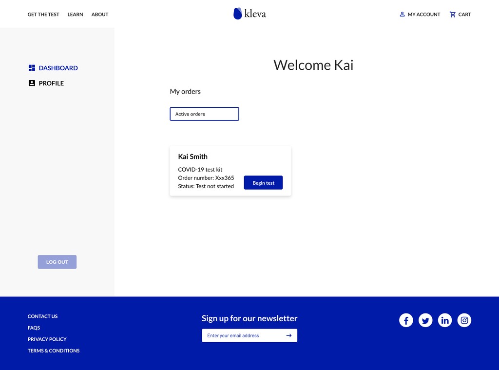
Empty first touchpoint: Users logging in saw a blank dashboard with no clear next steps.
Complex product SKUs: Two purchase paths (“Test Now” vs. “Test Later”) created confusion.
Aligning to brand: Early mocks didn’t match Kleva’s evolving style guide or the “modern, minimal” direction the lead wanted.
Design Requirements
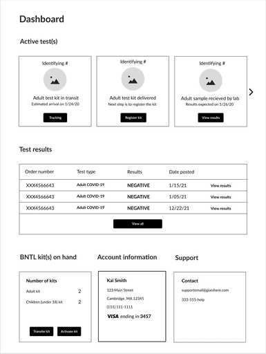
Immediate clarity: At-a-glance display of active tests and kits on hand.
SKU differentiation: Clearly differentiate between "Test Now" and "Test Later" purchase paths.
Support & sharing: Easy access to help and the ability to share kits with family.
Scalable layout: A card-based system accommodating future test types.
Consistent branding: Modern, minimal UI aligned with Kleva’s full style guide.
Early Iterations
Wireframes & feedback: Initial sketches separated “Active Tests” and “Kits on Hand,” then incorporated design-lead requests for increased whitespace and updated typography.
Version 1 visual design: Applied brand colors and assets but proved too cluttered and relied on an outdated font.
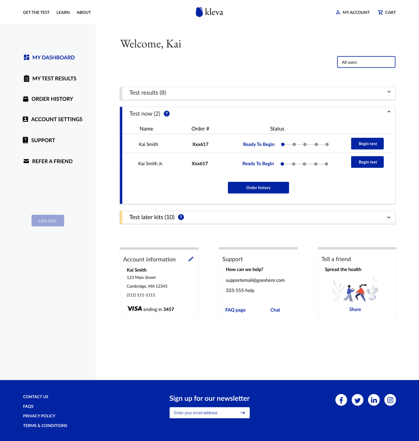
Version 2 refinement: Introduced accordion patterns to modularize content and reduce visual noise.
Version 3 approval: Final polish—spacing, alignment, and component tweaks—earned sign-off to move into testing.
Usability Testing
Usability testing: Five 30-minute Zoom sessions revealed users struggled with the two SKUs and couldn’t locate the purchase flow; this insight led Kleva’s founders to consolidate to a single test-kit SKU.
Final Designs
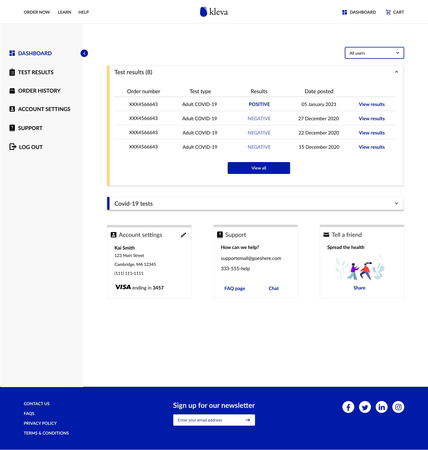
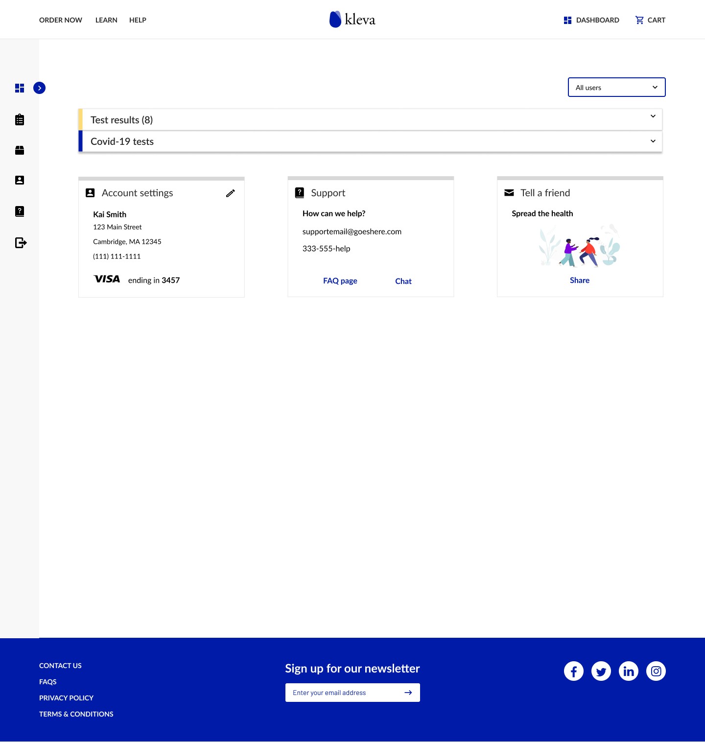
Unified test card: Combined status and inventory into one expandable card, with clear labels for pending and completed states.
Navigation overhaul: Added a collapsible side menu and revised top-nav labels (“Order Now,” “Learn,” “Help”) to streamline ordering.
Developer deliverables: Supplied full component specs—including empty, active, and completed states—and side-nav guidelines for implementation.
Business Model Pivot: Usability insights directly led Kleva’s founders to consolidate from two SKUs into a single test-kit offering—simplifying both the dashboard UI and the company’s sales model.
Enhanced User Clarity: Participants in testing rated the streamlined dashboard as clear, modern, and intuitive, with no further confusion over product activation paths.
Scalable Design Framework: The unified card component and collapsible navigation now serve as a flexible foundation for adding new at-home tests and features with minimal redesign effort.
Kai Lim
Founder, President of Klevahealth
"Nikky is a pleasure to work with. She was in charge of building the wireframe for Kleva's dashboard. She did a great job in conducting user interviews and iterating on the wireframes to reflect the user insights. Would be keen to work with her again."